GetOnSite Induction Pro.
Managing companies health and safety inductions

PROJECT OVERVIEW
GetOnSite is a platform that enables companies to manage health and safety inductions online, efficiently and securely. By streamlining workflows and centralising essential data, it helps businesses stay organised, compliant and in control.
We partnered with GetOnSite to build a new induction management platform from the ground up, designed to better support existing customers while opening opportunities in new markets.
Would you like to chat about the work we do?
PROJECT TEAM + SERVICES


- Strategy Analysis
- Project Management
- Front + Back-end Development
- UX + Wireframes + Prototypes
- Creative Direction
- Accessibility + Style Guides
- User Interface Design
We’ve partnered with Storm for over a decade and have a fantastic time working together. They take the time to listen and understand our needs so we can walk in step at every stage of the journey and produce excellent results together.
— Sarah Fenwick, Managing Director, GetOnSite.
THE BRIEF
Evolving what we built.
We originally built the Ruby On Rails, GetOnSite induction platform back in 2015. Since then, it has run reliably with ongoing security updates – but with major advances in technology and new opportunities emerging, it felt like the right time to rethink and rebuild.
An honest and collaborative discovery phase gave us a rare advantage: nearly a decade of real-world insight into how the platform was used day to day. We were able to carry forward everything we’d learned, while freeing ourselves from the technical limitations of the original build.
At the same time, we had to carefully challenge our own assumptions. Both the GetOnSite team and their customers were familiar with the existing system, so introducing new ideas required sensitivity and clarity. The goal wasn’t changed for the sake of it, it was meaningful improvement, delivered in a way that users could adapt to with confidence.

THE BUILD
Building with purpose.
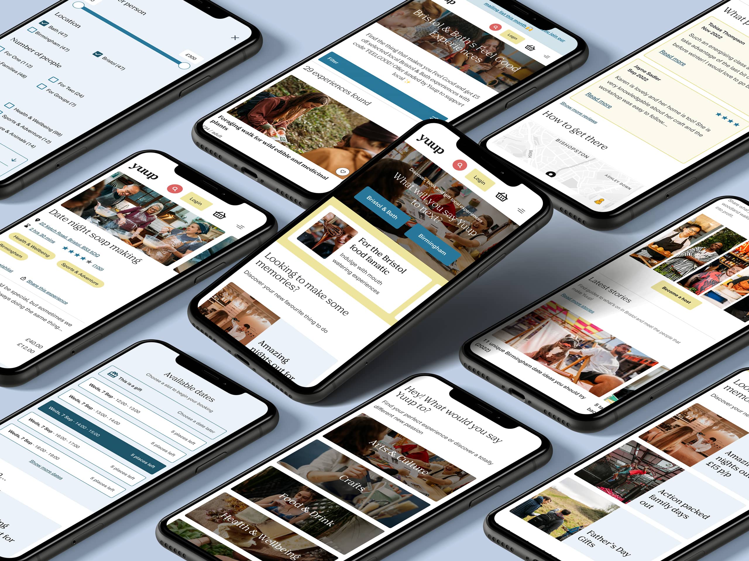
Following a focused discovery phase, we moved into MVP design and build with a clear set of shared goals: broaden the platform’s reach, give users greater control over their data, clarify the brand throughout the product, and enable customers to manage the system independently.
With those priorities in place, we designed and built a flexible new induction platform centred around a fully configurable induction builder. Organisations can structure their content to suit their operations, create quizzes to check understanding, and build forms to collect essential information – all within a clear model of locations and contracting companies that supports day-to-day compliance.

Unique challenges
Refining the experience.
With strong brand and technical foundations in place, the UX challenge was as much about unlearning as it was about designing. We had to question long-standing habits from the previous platform – separating genuine user needs from familiar but unnecessary quirks.
Through workshops and testing, we identified what was essential and where thoughtful improvements could create more meaningful impact. A new brand language, built on modern, accessible design principles and reusable components, formed a clear and consistent UI. The focus was simple: help users access, understand and act on important data effortlessly, while giving them the flexibility to create fully customised inductions with a professional, high-quality feel.
Following multiple rounds of positive user testing, the result is a powerful, intuitive platform – one that introduces significant improvements while remaining familiar and trusted to those who rely on it every day.
It’s been a brilliant opportunity to return to a platform we know inside out and build something even stronger on that foundation. The response to Induction Pro has been hugely positive, and we’re excited to keep working alongside GetOnSite to push the platform forward as it continues to grow.
— Storm Project Team
Ruby on Rails
We have over a decade of building exceptional applications for start ups and scale ups. Could Ruby on Rails be perfect for your next big idea?
Shall we have a chat?
Do you have a general enquiry you’d like to make, or fancy a more in-depth conversation about your business or project idea? We are always happy to hear from you.