The humble logo – small, pretty and simple. But nestled somewhere in those few pixels lies the power to make or break a business. That’s some heavy weight for such a little guy.
Having just finished working on an identity for a project my agency is involved with, I thought documenting the evolution of the logo from conception to completion along with how I personally go about designing logos would make a pretty sweet blog post. So without further ado, Designing a Logo- the Creative Process.
———
If you’ve ever seen Men In Black, there is a scene where Will Smith’s character, Agent J is finally deemed worthy enough to be given a gun to defend himself by his mentor Agent K. They head into an armory packed with huge guns, of which Agent K awards J with the tiniest one of all, ‘The Noisy Cricket’. A disgruntled J accepts the tiny weapon, not in the least bit impressed at it’s small, elegant stature.
When the opportunity finally arrives for Agent J to use The Cricket, the little gun turns out to be so powerful it obliterates everything in its path, and blows him a great distance off his feet.
When designing a logo, it has to be a Noisy Cricket. Simple, sleek, and pack a lot of power.
Getting Started
As with anything in the creative industry, before the fun begins there needs to be a proper period of planning and research into your project or client, but this is particularly vital in the case of logo design- like the Noisy Cricket, a lot of power has to be packed into a tiny object.
My method of getting started on a project like this begins with talking to a client. A proper discourse with a client is integral to a successful project. I tend to ask about their target audience, business values and presence, and whether they have existing colour schemes they may use in other aspects of the company image that they want to factor into their logo.
I then sit down at my computer with a pen and paper and just mess around for a few hours, not specifically drawing logos (though many do get doodled during this stage) but just noting down keywords, associations, anything that might prompt a thought.
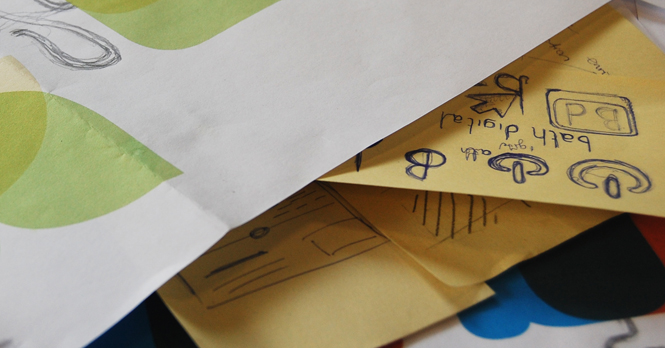
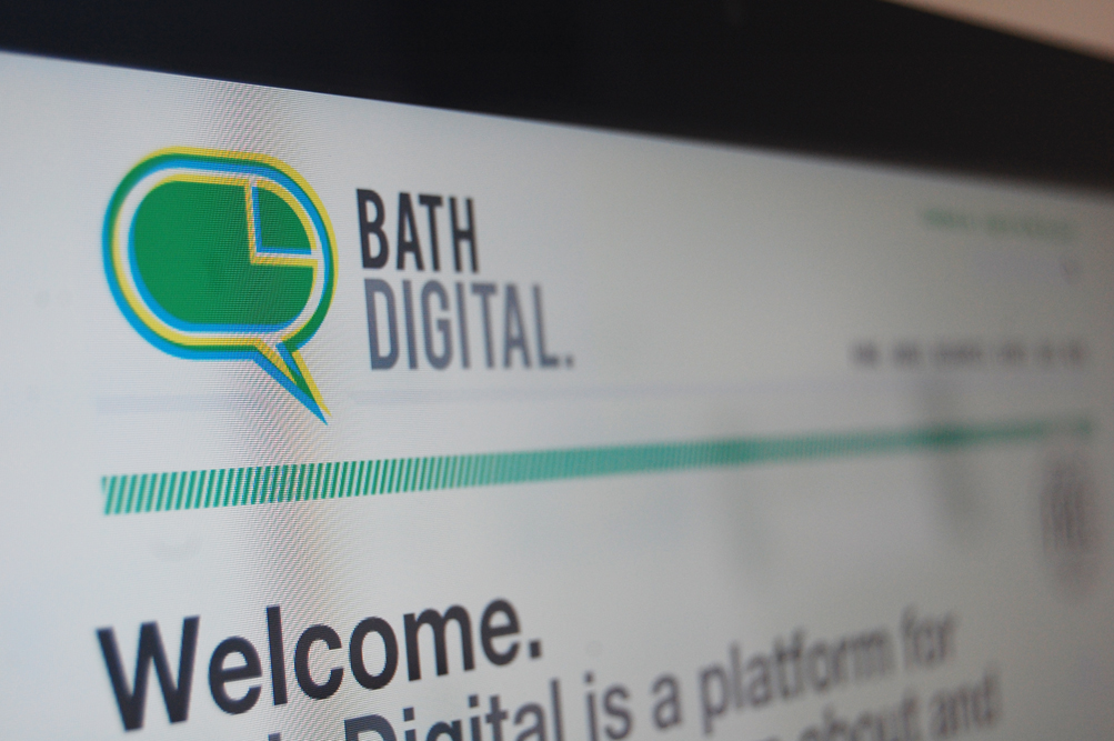
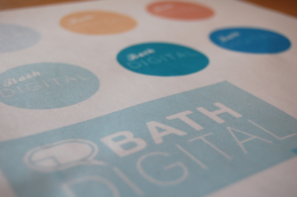
The logo i will be discussing in this blog post was for ‘Bath Digital’, a project intended to educate Bath-based businesses about the powers of web and Ecommerce.
In getting started with the Bath Digital logo, I decided on creating two separate streams of thought- one for ‘Bath’, and one for ‘Digital’. I find these sorts of techniques are particularly useful in logo design, as they enable you to visualise many factors of a word or idea that you may not ordinary see.
For example, in the image on the left, you see my doodle of an ‘On’ button, the connotations between an ‘On’ button and the word ‘digital’ are fairly obvious, but only through dismantling the word ‘digital’ and writing down everything that came to mind, I got close to a possible idea. If you look at an ‘On’ symbol, you can sort of see a lowercase d, back to back with a lowercase b, almost the initials of the business! Obviously in this case it didn’t work, but it’s an example of how ideas begin to materialise if you properly analyse the stuff you get from good research before a project.
Ideas into Imagery
After this stage, the real design begins. I begin transferring all my sketched ideas to screen, and play with various colour schemes and fonts. Below you can see the first set of four logo ideas I created.

I like to present a client with 4 options- I feel any more than this complicates things and dilutes your hard work. I like to make these 4 options fairly diverse, I attempt to cover a broad area, from simple, corporate-style stuff to more abstract or trendy design. I have them pick their favourite, then move on to step 2, refinement, which i will cover in the next section of this post.
In terms of the Bath Digital logo, the team decided that out of these 4, we should narrow it down to two for further development, rather than one, as they were both very much liked.
Refinement & the Finished Product.
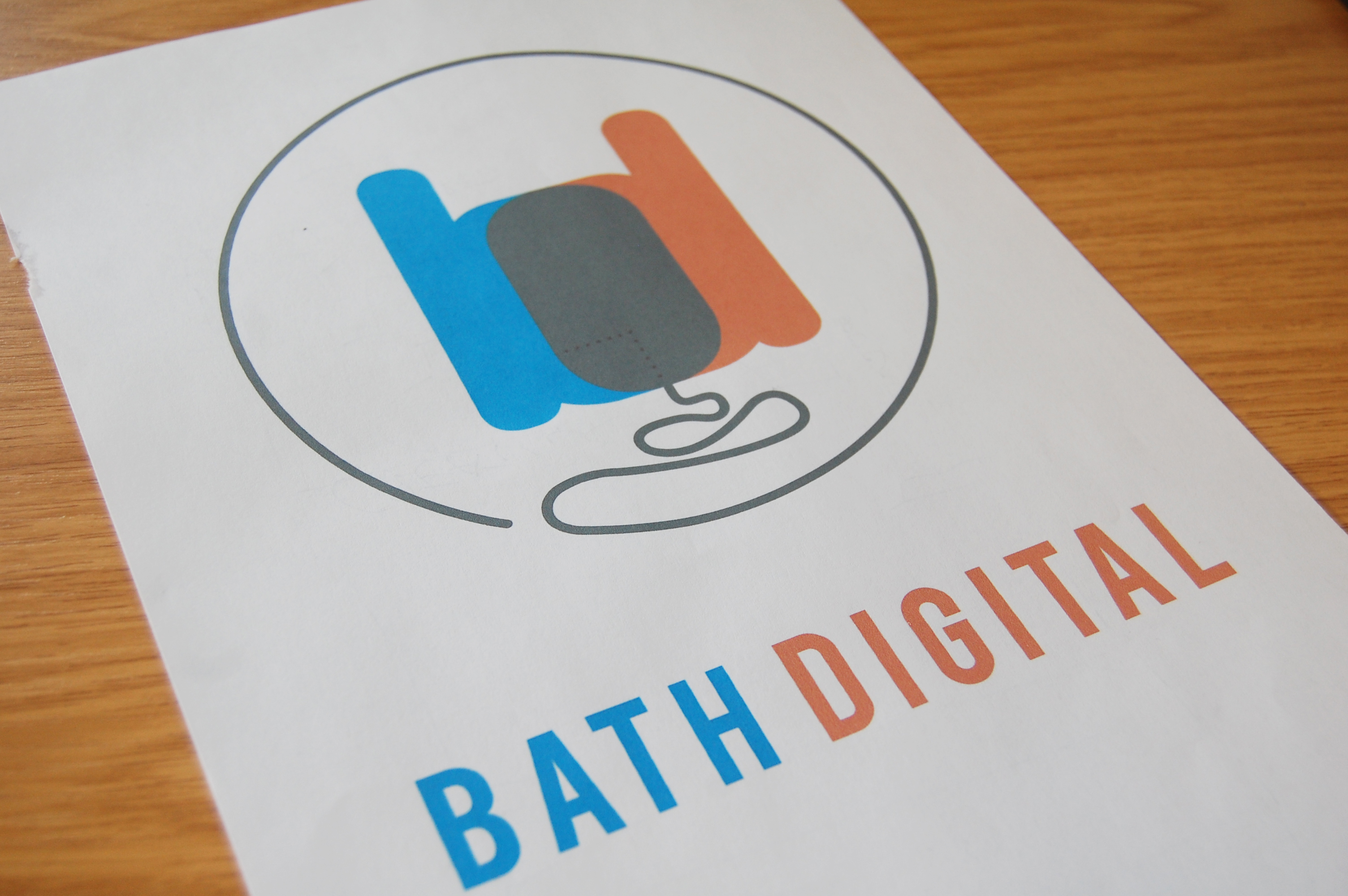
After some feedback on one of the Bath Digital logo choices below (feedback is a key role in refining a logo) there was some worry that the ‘b’ & ‘d’ weren’t working well enough to convey that they were letters, and that the mouse lead wasn’t sufficiently mouse lead-like (it looked more like a devil’s tail somebody said) so during refinement I decided to add indents and curves to the ‘b’ and ‘d’ in the logo so as to better identify them as letters, and after a lot of work managed to convey the idea of the mouse to a fairly okay standard, I think.
from this:

to this:
Even though I was really pleased with this design, what you as the designer think is best can sometimes not be what’s best for the business you’re designing for, and in this case we decided that it didn’t fit the image of what Bath Digital was setting out to achieve, and who it wanted to attract to use its services- and that a simpler, more accessible logo would be needed to appeal to the wide range of businesses it wanted to communicate with.
I rarely am able to nail a logo first time, only after numerous tinkering and adjusting, and a prime example of how much a particular idea can change is the design we chose to finally go with for Bath Digital. With the other logo option the team chose for developing, everybody loved the mouse within a speech bubble design you can see on the second of the four logo ideas sheets posted above- it seemed to simply and properly communicate the idea of what Bath Digital was about. I decided to start from scratch with the idea, re-doing the font and adding some layer styles to produce something completely different to what was originally a fairly lifeless logo.
After a lot of umming and ahhing about the colours within the team, an agreement was reached and we had our logo. Simple, accessible, and it conveys a message.
A Noisy Cricket? I’ll let you decide.