Visit any website today and you’re more than likely to see a site complimented with photographs and imagery. Websites have been using photos as a way of getting visitor’s attention and delivering a specific message or feeling for almost as long as the internet has been around, and much like every other facet of the internet, the use of photography in web design has evolved greatly. Photos are now used in a variety of contexts, from small central elements to being the entire background of a site. A favourite technique of mine lately is using a large image as the entire header element with content placed atop the photo. Below is a small showcase of some recent Storm projects utilising this effect and some comment into the individual designs.
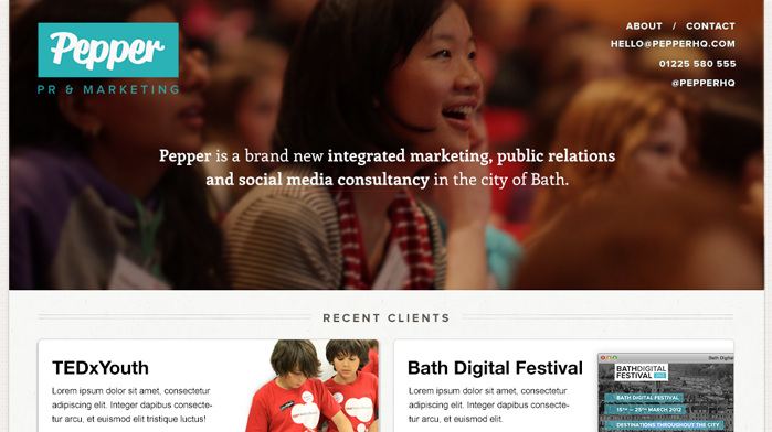
Using a photograph containing happy, smily people in web design is fairly cliché but if the photo doesn’t totally resemble a cheesy stock image you can sometimes get away with it. I found the soft focus and colour palette of this photo quite appealing and found the subject matter engaging whilst not being too distracting to the core message of the page, the sentence explaining what the company do.

This is an example of many collaged images coming together to create a one larger image. Adding some simple layer effects to give age to the image and a subtle hint of red to evoke a feeling of blood result in a decent backdrop for the core message.
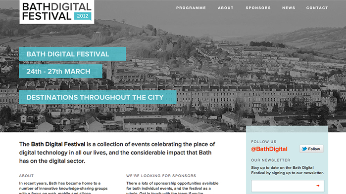
When using large photographs in this fashion for websites it is essential that the photograph is of suffiicient quality if it is to take up the prime real estate at the top of the page. We tried many different photos of Bath before landing on this one- the sky in the photo was the decisive kicker, it created a nice delta for the menu to sit in!
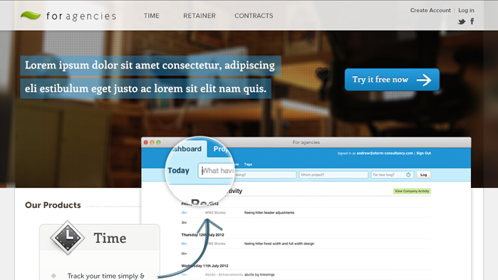
Here is an example of using large photography subtly- the focus of the page is the core message, the call-to-action and then the snippet of the app below rather than the photo, yet the image still manages to deliver a feeling of the intended userbase of the product.
