Unseen.
Working towards a world without slavery

PROJECT OVERVIEW
Unseen is a UK based charity who provide safe houses and support in the community for survivors of trafficking and modern slavery.
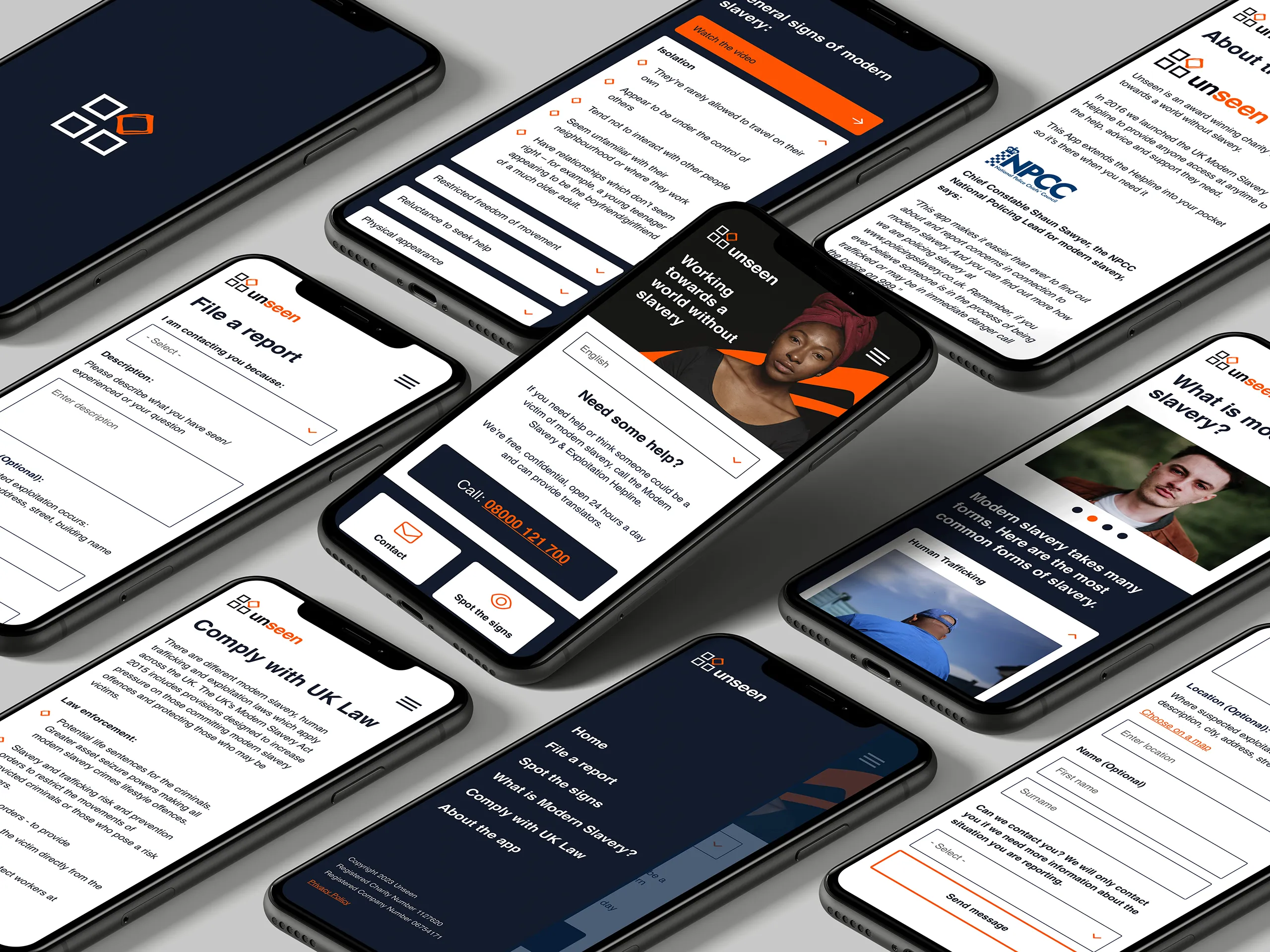
Storm worked with Unseen, who were our Charity of The Year in 2023 to build a native mobile app to educate people about modern slavery as well as providing a way to report suspected cases.
Would you like to chat about the work we do?

I’m delighted with the app that Storm has produced for us. It looks great and it works seamlessly. The app is an important tool in the fight against modern slavery, used by thousands of frontline workers up and down the country, so it has to be of a very high standard. Storm have more than delivered for us
— Andrew Wallis OBE, CEO, Unseen

The brief
Modern usability.
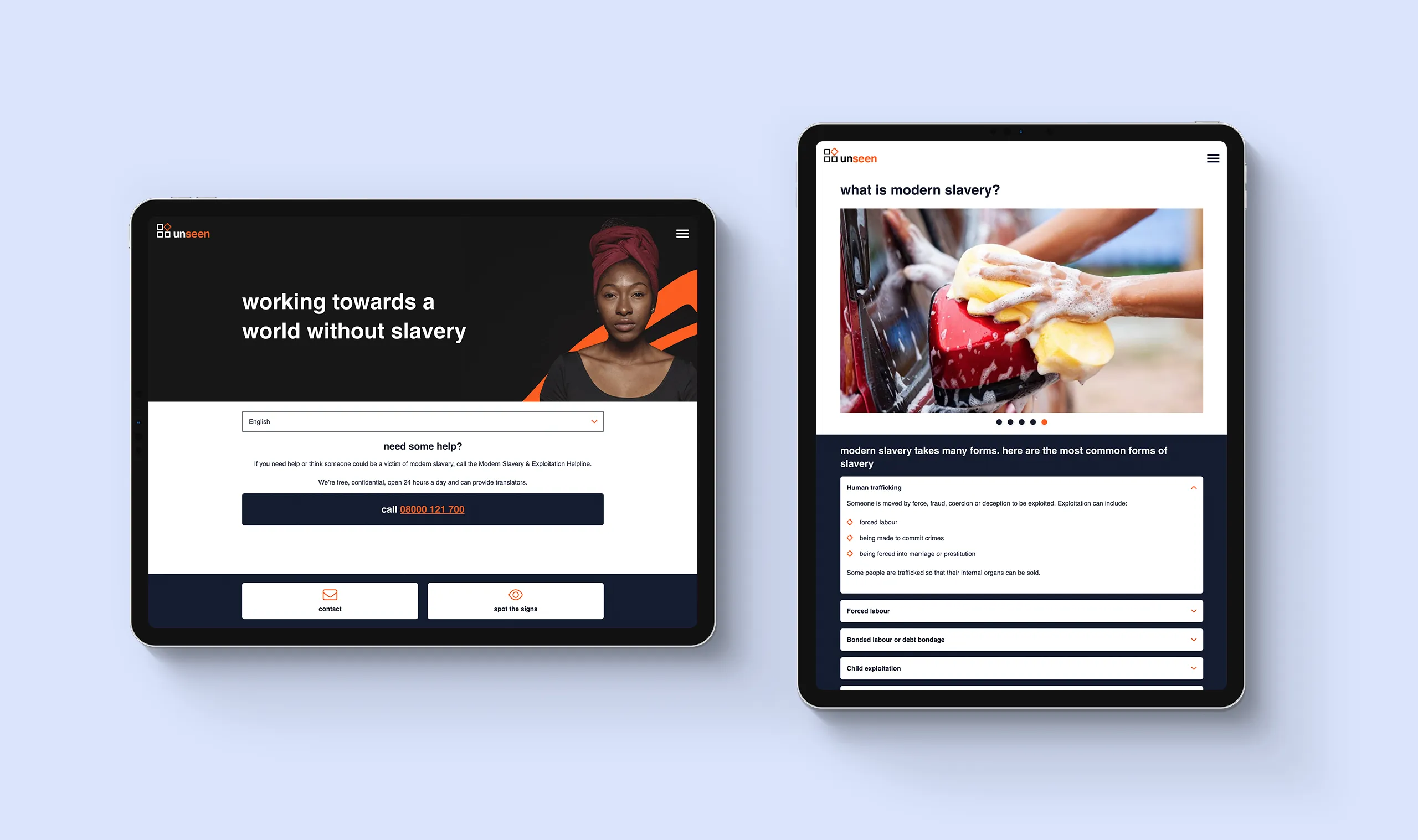
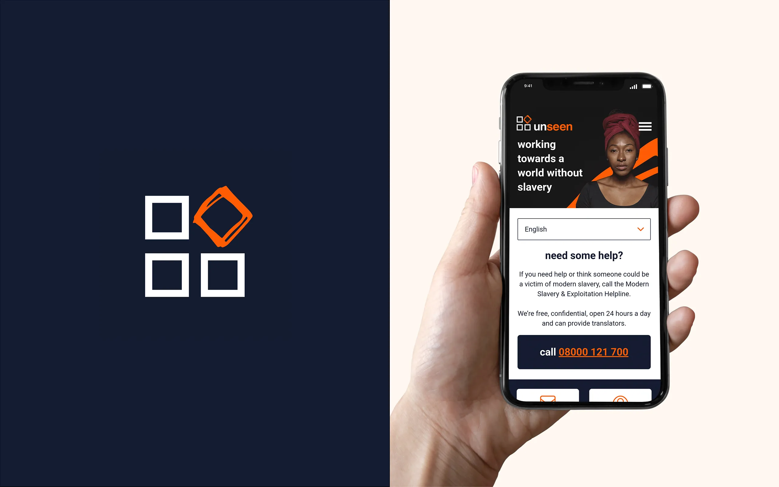
With the charity having been through a recent rebrand, it was the perfect time for us to build them a new app that aligned old and new. We designed the app to match all of the modern stylings of its website counterpart. Along with creating an updated look and feel, we restructured the app, putting the user first by making getting in touch with the Modern Slavery Helpline in a possible dangerous situation the top priority, along with educating users with how to spot the signs of slavery.

Unique challenges
Future-proofing the system.
Leveraging our Ruby on Rails expertise, we continued to develop the app in its original format. As well as being a web app, we utilised Cordova to create versions for both Android and Apple app stores. The app’s content is now editable via an online CMS, allowing Unseen to provide the most current information to their users.

international adaptation
Speaking your language.
To ensure the app was accessible and trustworthy to victims from diverse linguistic backgrounds, we prioritized multilingual support from the outset. We designed the app and its content management system (CMS) to allow Unseen to easily add new languages as translations become available. This enables them to quickly expand the app’s reach and cater to a wider audience.
It was great to work with Unseen, our charity of the year, to provide a valuable tool for the work they do, it was an exciting challenge to build a mobile application while respecting our Ruby on Rails roots, and it has been great to see the response to the app so far. Our experience has given us a strong framework and we look forward to building mobile applications in the future.
— Storm Project Team

Ruby on Rails
We have over a decade of building exceptional applications for start ups and scale ups. Could Ruby on Rails be perfect for your next big idea?

Shall we have a chat?
Do you have a general enquiry you’d like to make, or fancy a more in-depth conversation about your business or project idea? We are always happy to hear from you.


