Interaction.
Experts in the modern workplace, delivering Perfection at Pace
PROJECT OVERVIEW
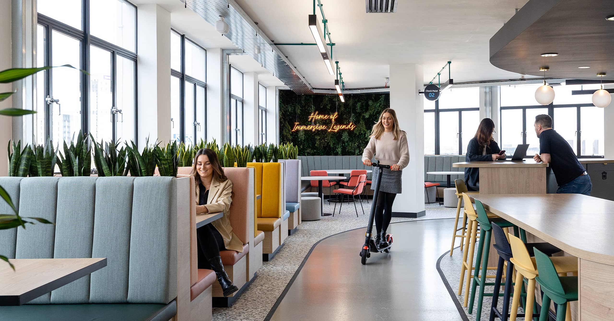
Everyone deserves a space to thrive and Interaction are experts in the modern workplace. We worked with Interaction to build a website that showcases their expertise and pursuit for perfection.
From strategy to space dressing, Interaction have been designing and building workspaces for over 30 years. Creating them a brand new website to highlight their key services, vast portfolio and desire to hire the brightest talent was a welcome challenge.
Would you like to chat about the work we do?
I wouldn’t hesitate to recommend Storm to anyone looking for a capable, creative and diligent agency partner. They took the time to comprehensively get under the skin of our business, understanding our vision, positioning, goals, challenges – and the role of our website within that framework. The team were quick, responsive and proactive, guiding us painlessly through the process until we launched a website which ticked all the boxes of our brief.
— Toby Brown, Interaction
The brief
Room for improvement.
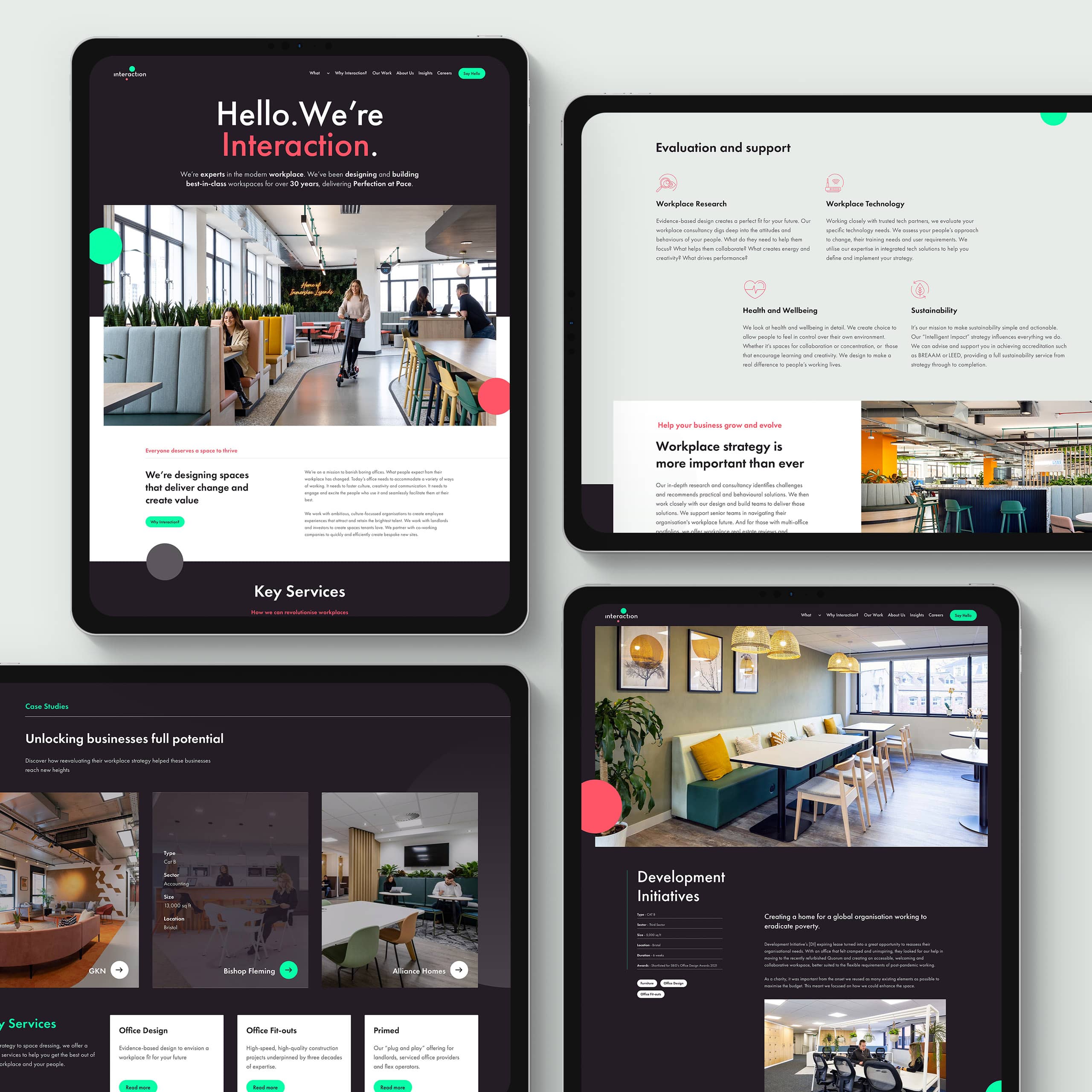
Interaction needed an online evolution, one that supported their mission to revolutionise all workspaces. It was key that the new website communicated the scope of Interaction’s key services that are not only design but also strategy, build and comms, brought together with technology. It was also important to showcase a portfolio that gave the user the flexibility to find relevant projects with ease. The final piece of the puzzle was to create spaces that allowed Interaction to talk about their news, insights and most importantly their career campaigns.
Unique challenges
Style to inspire.
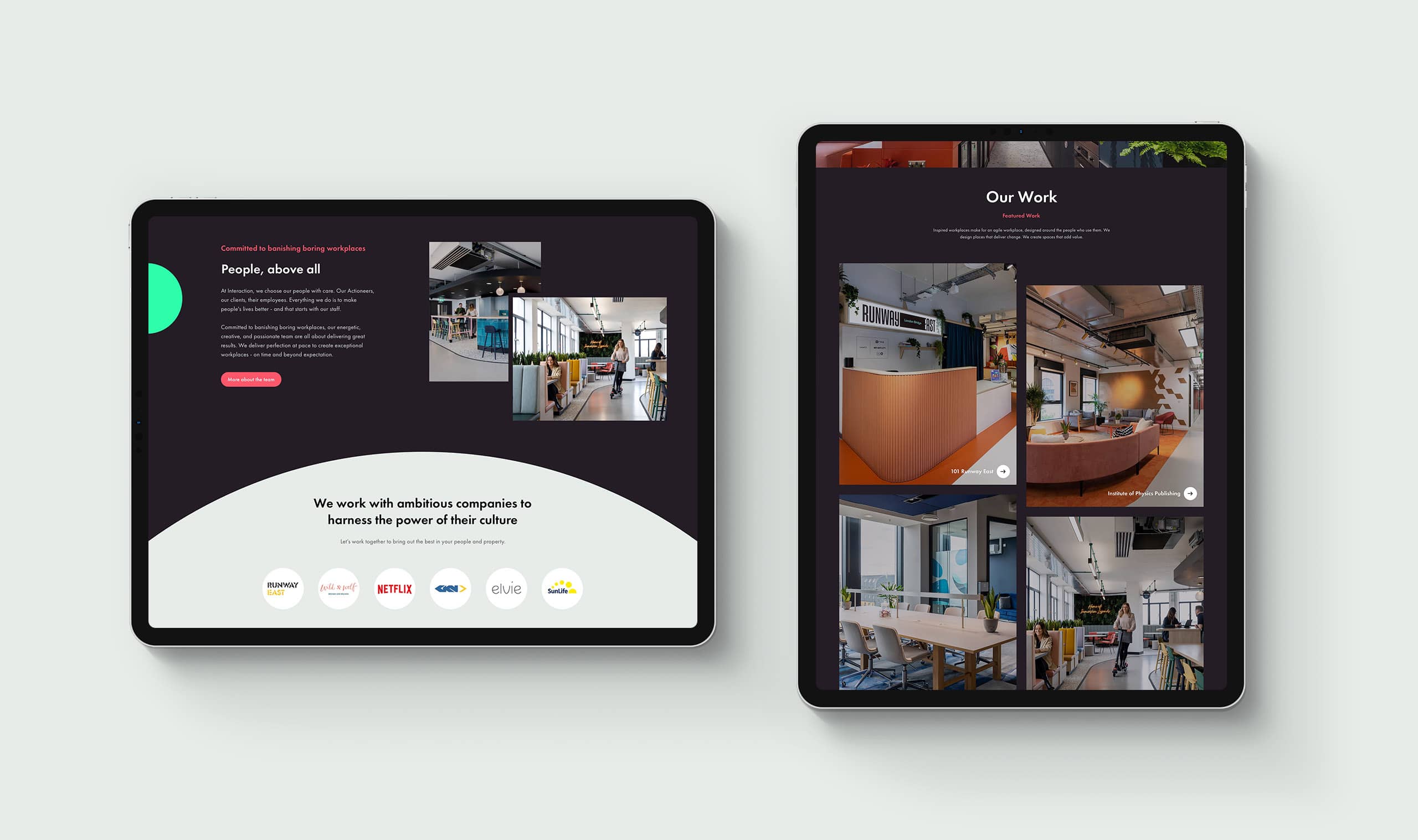
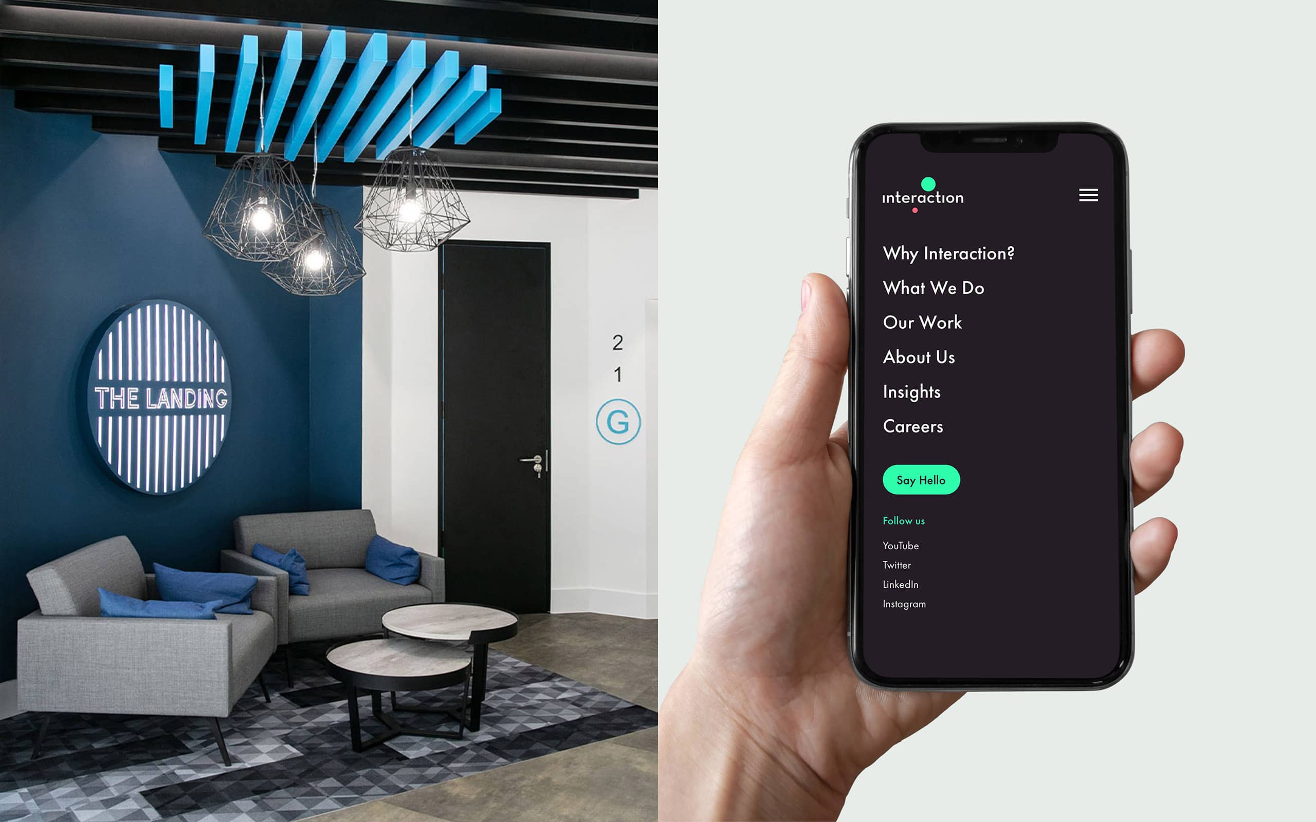
Interaction’s new website not only needed to unveil the breadth of their skillset, but also inspire business prospects and future team members. To achieve this, we presented Interaction in a more modern and editorial fashion, showcasing the work and culture they are very proud of. We broke down core services with their own feature pages, each showcasing exciting work, related services and case studies. We also gave the Interaction team a place to share their thoughts on careers, values and culture.
The build
Plans to expand.
Moving into the development phase. Our key goal was to utilise WordPress’ flexible Gutenberg CMS to cater to Interaction’s future plans, allowing them to grow and evolve over time. Going that extra mile and building the site this way gave Interaction the freedom and confidence to update their content with ease whenever they liked. Working in as many branded elements and variations as we could, meant Interaction never have to worry about losing out on brand impact and recognition, whatever the situation.
Working together with Interaction to bring their vision to life was a pleasure. For us, injecting their personality and culture into the website was a design and build challenge that has been a great success. We had a lot of fun ‘going big’, showing off their work with strong branding and photography and the end results speak for themselves. We can’t wait to see what Interaction have planned next!
— Storm Project Team


