Greener.
A genuinely sustainable supply chain matchmaking platform
PROJECT OVERVIEW
Greener is a brand new ‘free forever’, matchmaking platform that helps you build a genuinely sustainable supply chain for your food and drink businesses.
Greener tasked us with building them a platform that could create connections that matter, matching like minded businesses with shared values creating potential partnerships with exciting new sustainable suppliers.
Would you like to chat about the work we do?

The partnership worked incredibly well for us, particularly because the team shared our passion for the product that we were building. The whole process was extremely collaborative and communicative and we are so proud of the product we created together
— Dan Yates, Greener
The brief
A Fresh Startup.
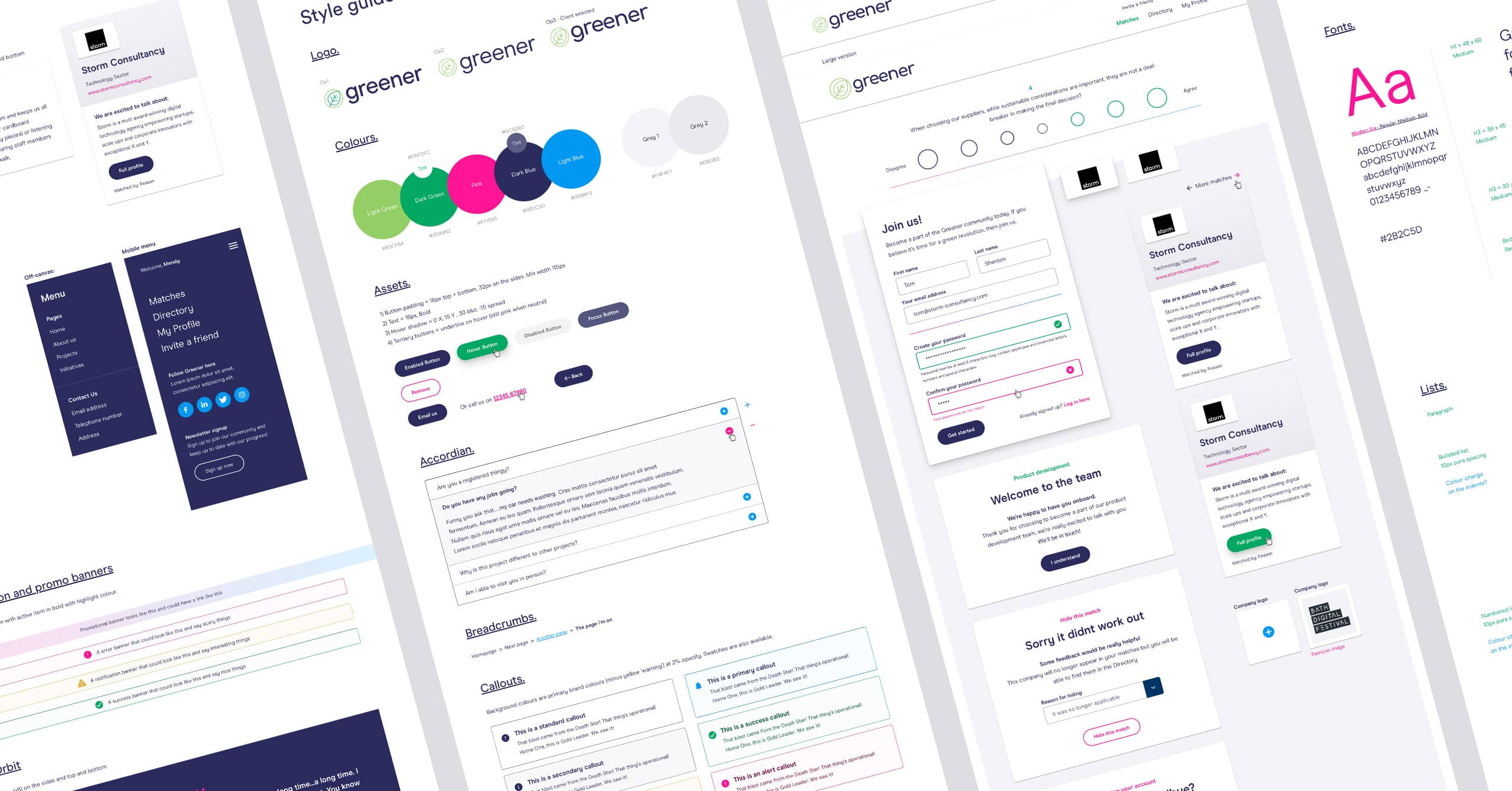
To kickstart the project we met with Greener to plan a new and improved brand identity that represented their vision and passion for connecting organisations in an open and collaborative way. The backbone of the brand is a vibrant green (naturally) partnered with bright pinks, deep blues and typography and a tone of voice that felt chatty but direct. We also created soft shaped illustrations to bring a ‘natural’ feel to the business. Once the brand was in place we created a comprehensive style guide of UI elements to bring the brand to life, allowing us to tweak, test and perfect brand and UX fundamentals early on.
Unique challenges
Building valuable connections.
G
Greener believes the best matches occur when businesses share common values. For example, an innovative company might pair well with an early adopter, while a safety-conscious organisation may prefer tried-and-tested solutions. By understanding these values, we can help connect businesses that are better suited to each other, leading to higher-quality partnerships.
To achieve this, we developed a mathematical model that scores questionnaire responses to determine an organisation’s personality traits. We then encoded this model into an algorithm that can compare these traits and calculate the compatibility between any two organisations, identifying promising matches.
Partner profiling
Finding the perfect match.
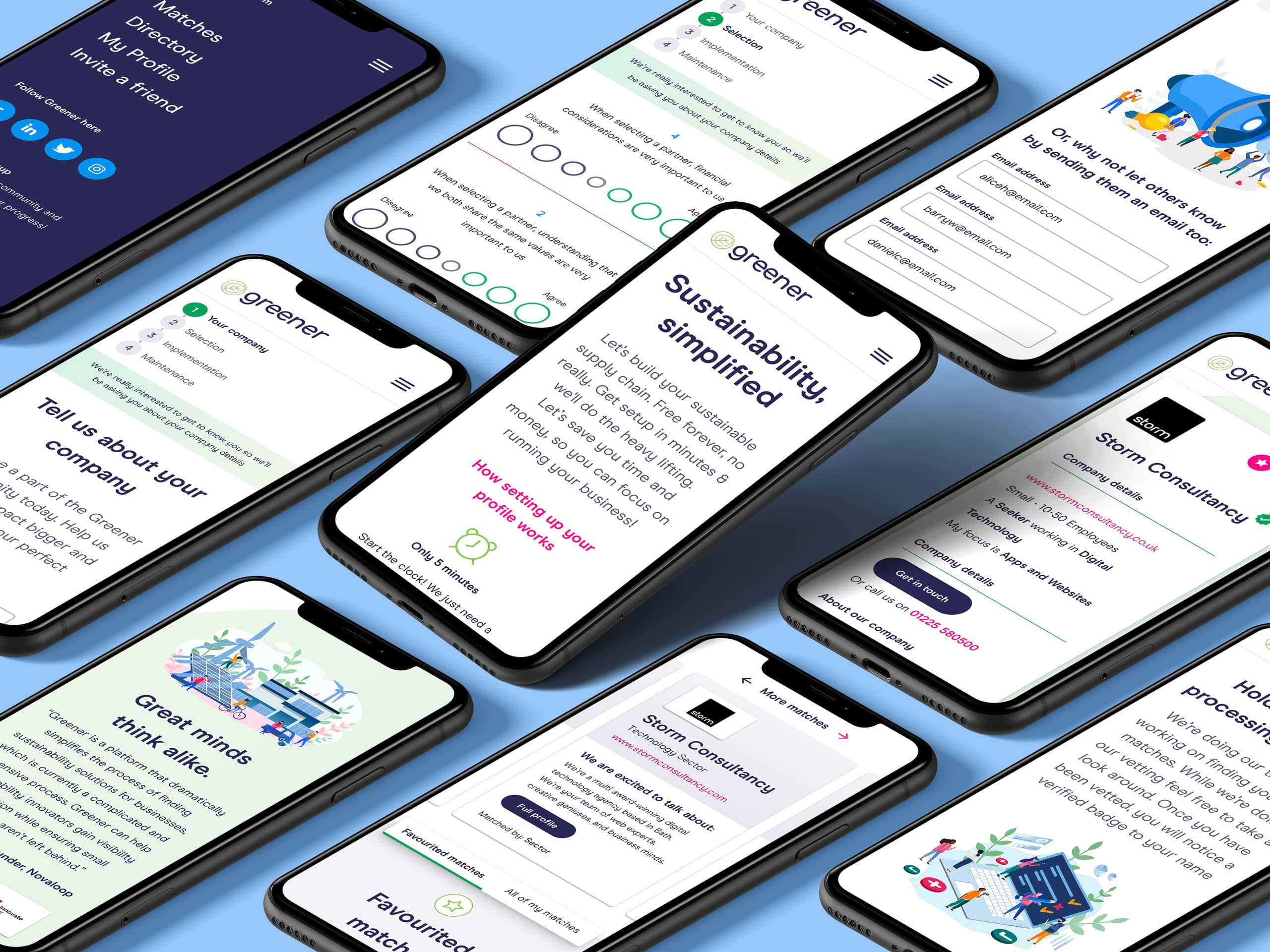
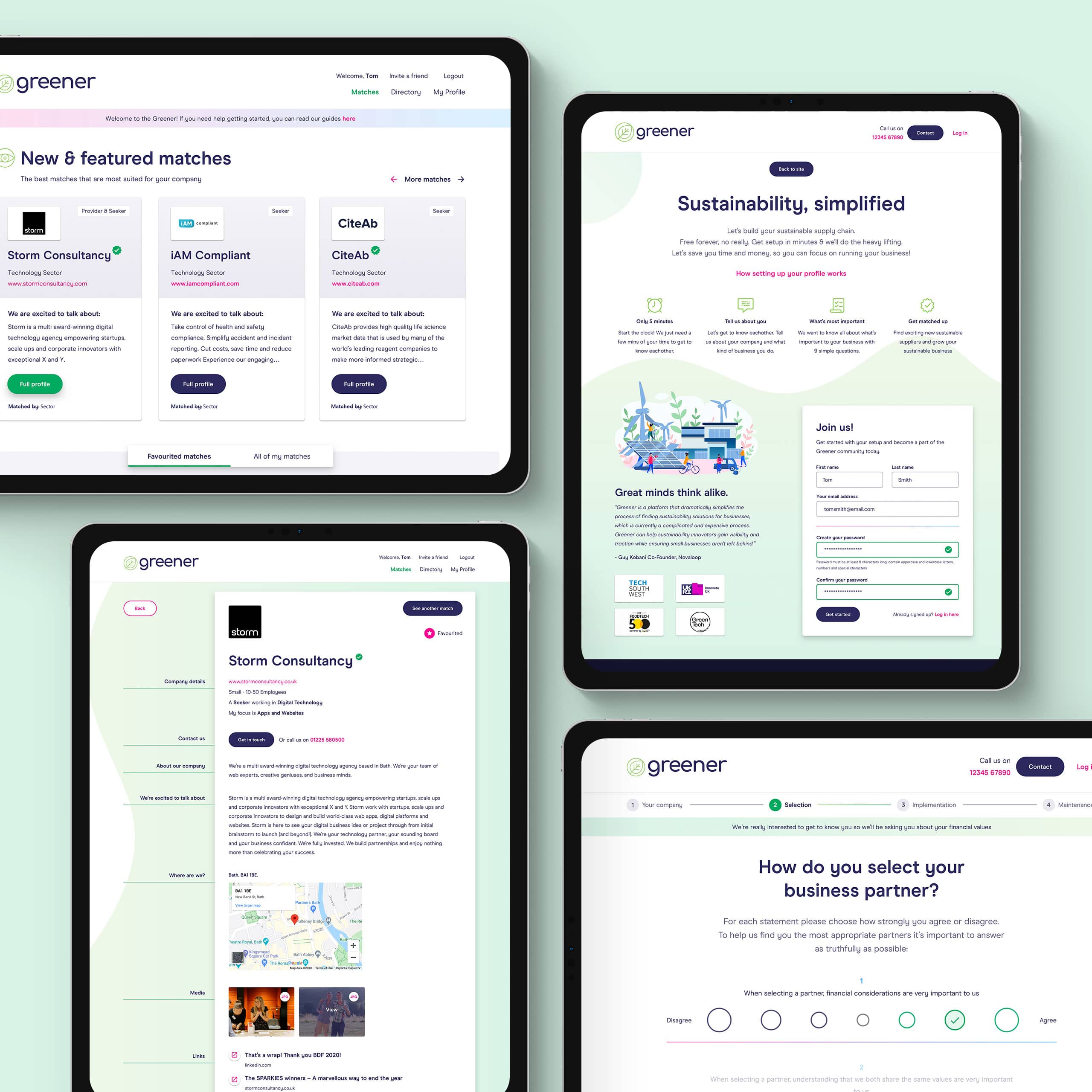
With our new brand, style guide and algorithm ready to go we got to work on the core app designs. We started by creating a 4 step sign up process complete with company profile and intuitive survey to gather information on the users stance and requirements when it comes to sustainable, green partnerships. We designed company cards that were calculated and presented to the user as matches based on their survey data. Each card displays whether the match is a Seeker or Provider and lets the user know what they’re most excited to talk about when it comes to business, product or services. Each business card is also expandable to show full company details and is able to be favourited.
Working with Greener to build a platform that radically simplifies the process of matching like minded businesses, big or small, in the name of sustainability got the whole team excited. Putting genuine problem solving and technology first to really change up an industry will always be infinitely rewarding. We can’t wait to see what connections are made and the innovations that come from them.
— Storm Project Team
Ruby on Rails
We have over a decade of building exceptional applications for start ups and scale ups. Could Ruby on Rails be perfect for your next big idea?
Shall we have a chat?
Do you have a general enquiry you’d like to make, or fancy a more in-depth conversation about your business or project idea? We are always happy to hear from you.


