Getting Married.
The new smarter way to organise your wedding.

PROJECT OVERVIEW
Smart couples are turning to the internet to help them plan their wedding. Getting Married are the UK’s favourite free wedding website and online guest list manager.
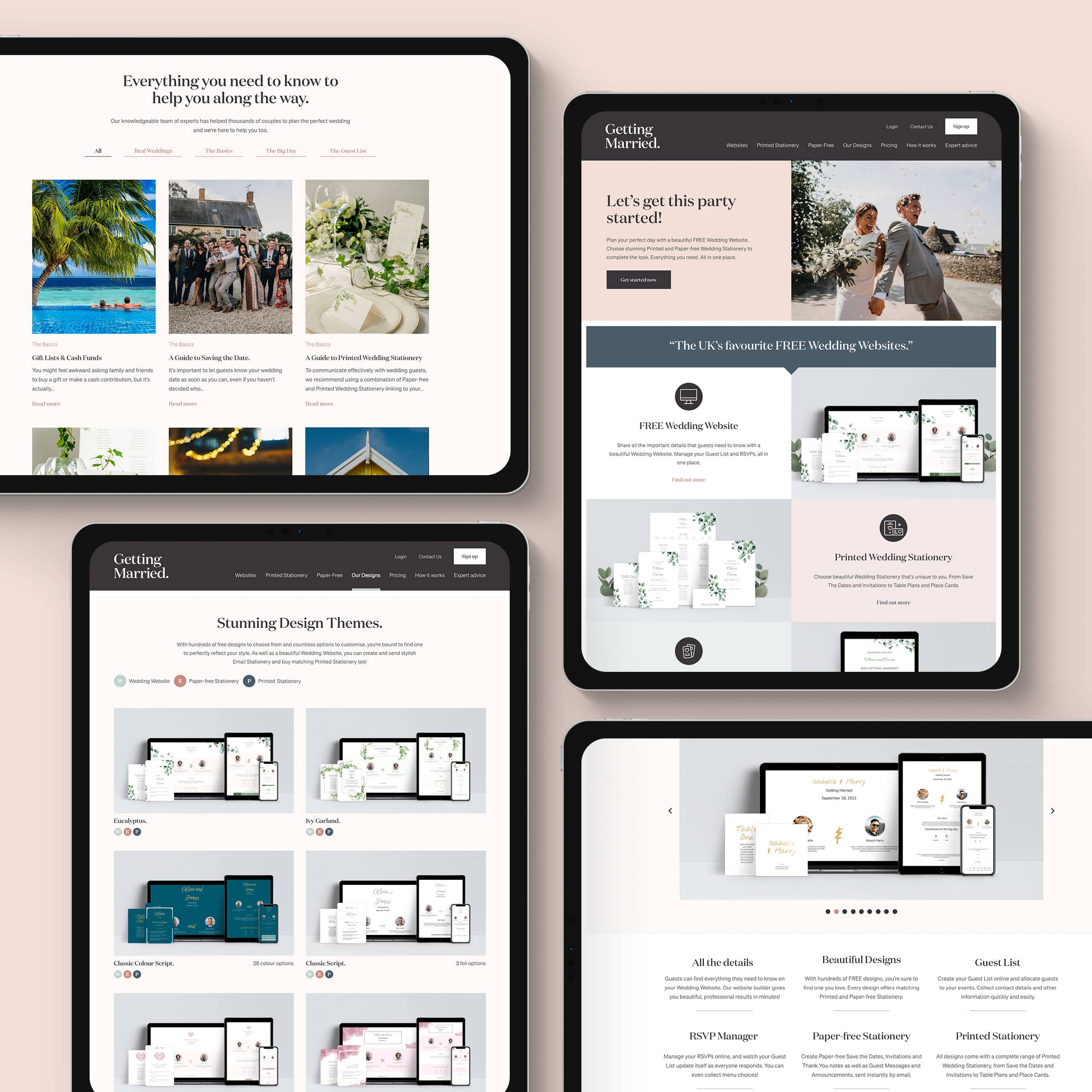
Storm partnered with Getting Married to create not only a beautiful marketing website but also a fully fledged online wedding planning site that covered everything from guest and event managers to a customisable wedding website builder.
Would you like to chat about the work we do?

The proposal
A hint of romance.
We pitched and created a brand that had a classic British feel, that felt premium with a hint of romance. Starting with a soft pastel based colour palette inspired by traditional wedding stationery to set the tone, a clean and curvy word mark shortly followed it. Complimentary typography was next up, using a modern a serif font to give the brand a functional backbone. Imagery across the brand should be celebratory and most importantly from real weddings, working with real industry professionals.

the site
Advice and inspiration.
Now to put the new brand to use. We got to work on Getting Married’s brand new marketing website which serves as a home for their services, invaluable wedding planning expert advice. The website is the perfect platform with it’s chunky call to action’s and ‘wedding inspo’ look to get couple’s straight into creating a free wedding website using Storm’s very own website builder. We designed the site with this inspirational look by using genuine wedding photography and testimonials from real GM couples.

the app
Building and planning.
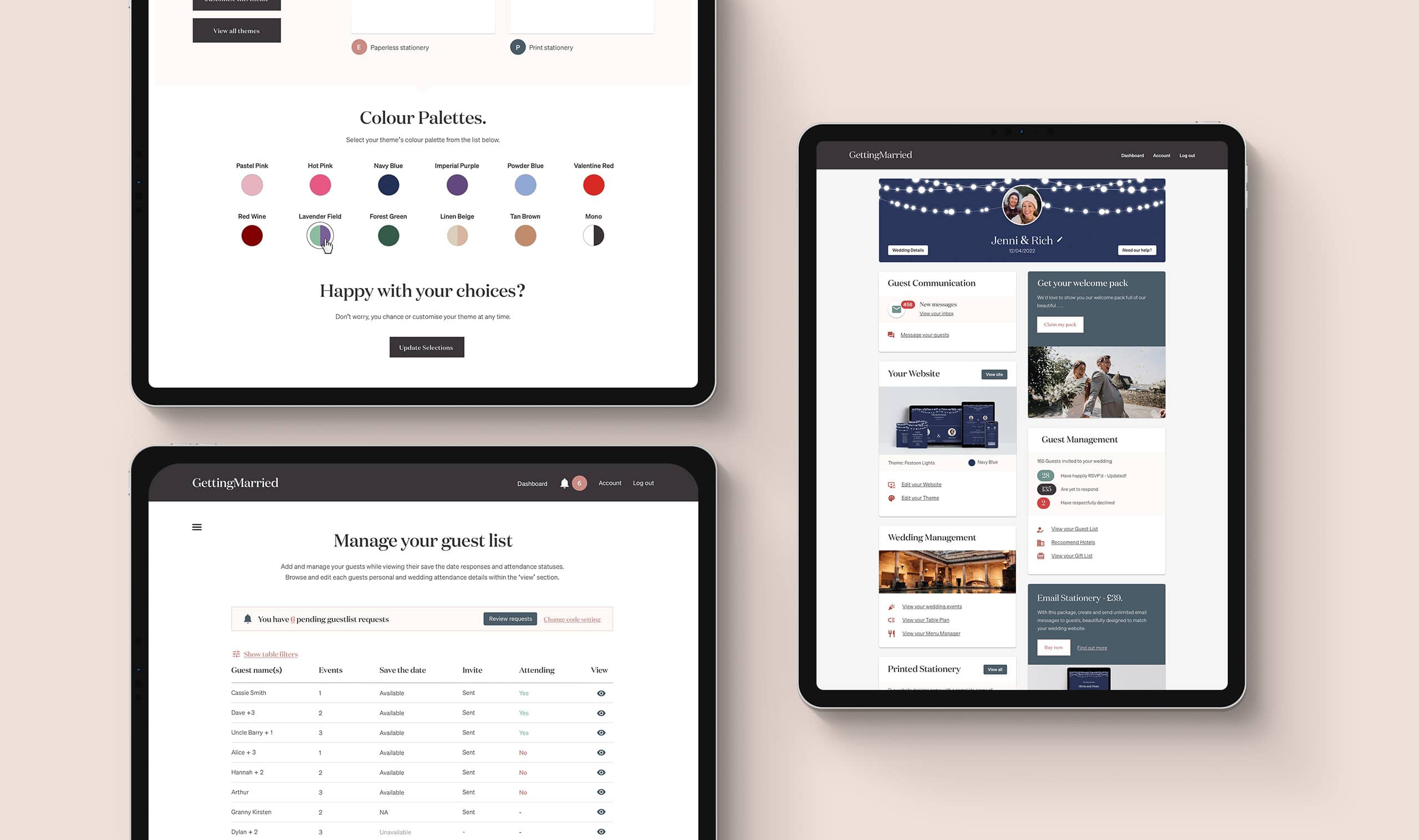
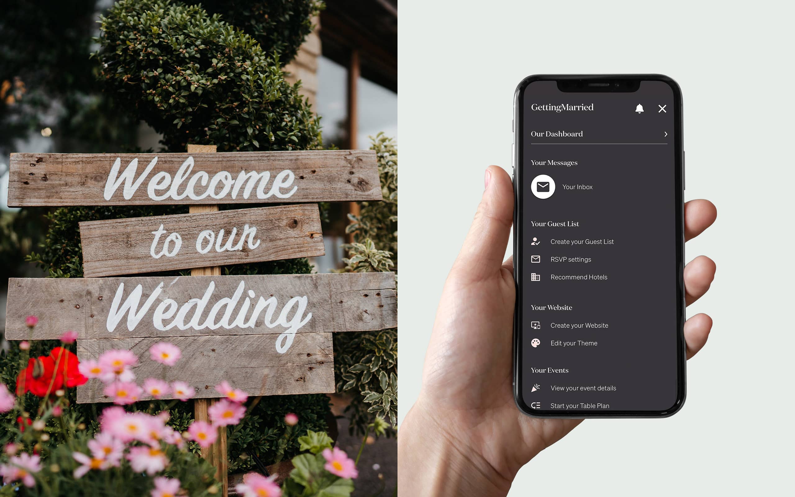
In short, we built everything a couple needs to plan their wedding. Our handiwork covers everything from website creator with customisable themes and content blocks, email Save The Dates and themed digital invitations with one click RSVP, guest list managers, event creation and management, table and menu planners, hotel recommendations, gift list integration and even email thank you notes. We also built a whole guest view with a secure login and messaging system to contact the happy couple. What more could you ask for?
Getting Married has changed the UK wedding planning scene, and it’s been a pleasure to be a big part of that! GM have gone above and beyond to supply their couples with everything they need to plan their big day. We love working with them, helping them continue to update and add new products to their service and while keeping in touch with their users.
— Storm Project Team

Ruby on Rails
We have over a decade of building exceptional applications for start ups and scale ups. Could Ruby on Rails be perfect for your next big idea?

Shall we have a chat?
Do you have a general enquiry you’d like to make, or fancy a more in-depth conversation about your business or project idea? We are always happy to hear from you.


