Canned Wine Group.
Marketing and eCommerce platforms for unique canned wines

PROJECT OVERVIEW
Canned Wine Group elevates thoughtful connection between people, planet and place, through the appreciation of wine.
We worked with Canned Wine to create a brand new marketing website showcasing their portfolio of canned wine brands, as well as a Shopify based eCommerce website to sell the Canned Wine Co. collection.
Would you like to chat about the work we do?
Storm helped us deliver a trade website that celebrates our success stories, delved deeply into our winemakers and the technical info on each of our wines, and shared news from our team. It’s a resource and tool we use constantly in our sales and marketing.
— Ben Franks, Canned Wine

Storm throughout were methodical, supportive, quick to problem solve, and understood exactly what we needed each site to do and why. It has set us up on a confident new chapter for Canned Wine Co.
— Ben Franks, Canned Wine

The brief
A new vintage.
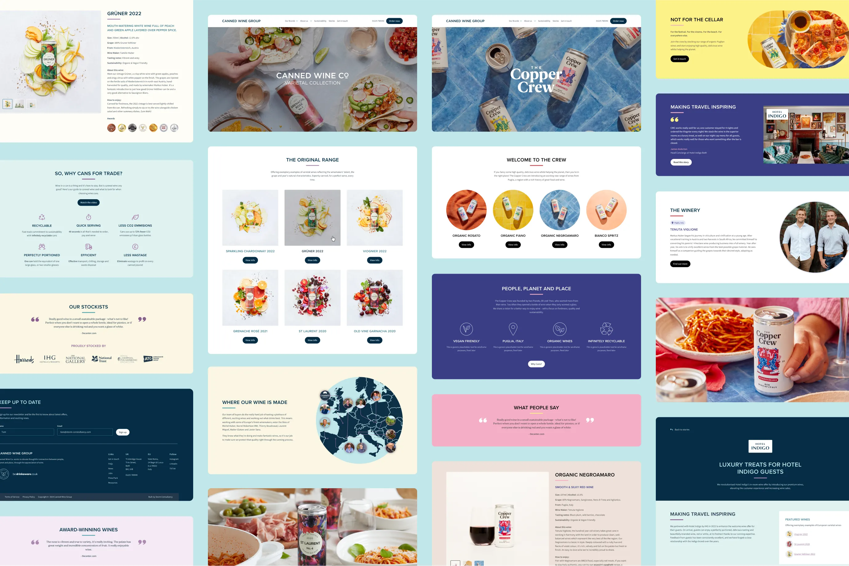
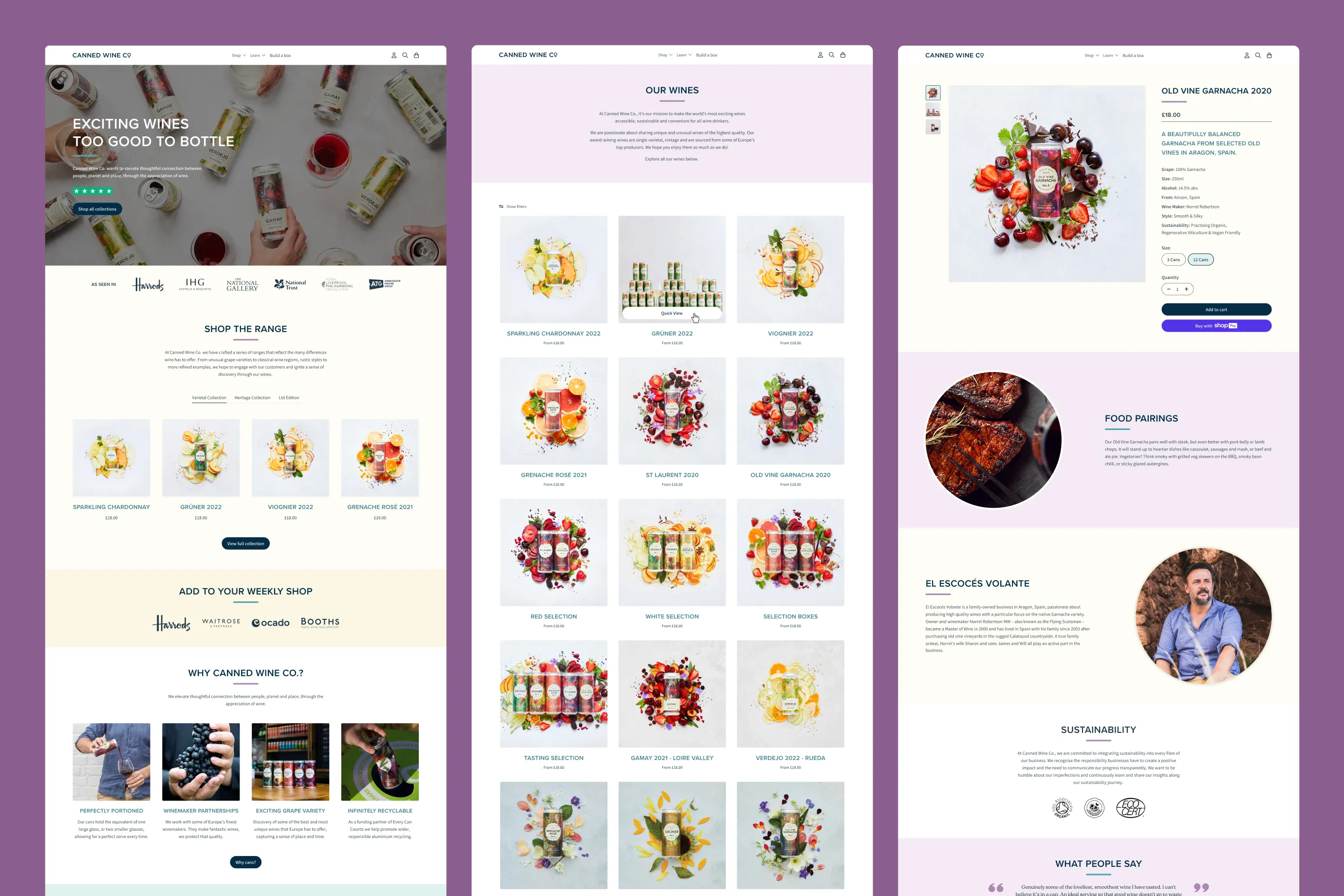
Having recently expanded their portfolio to three brands, Canned Wine sought a clear distinction between their trade website and e-commerce platform. We developed a cohesive theme that showcased their eye-catching product imagery and reinforced their brand identity. This ensured a seamless user experience across both platforms.
Unique challenges
A refreshing change.
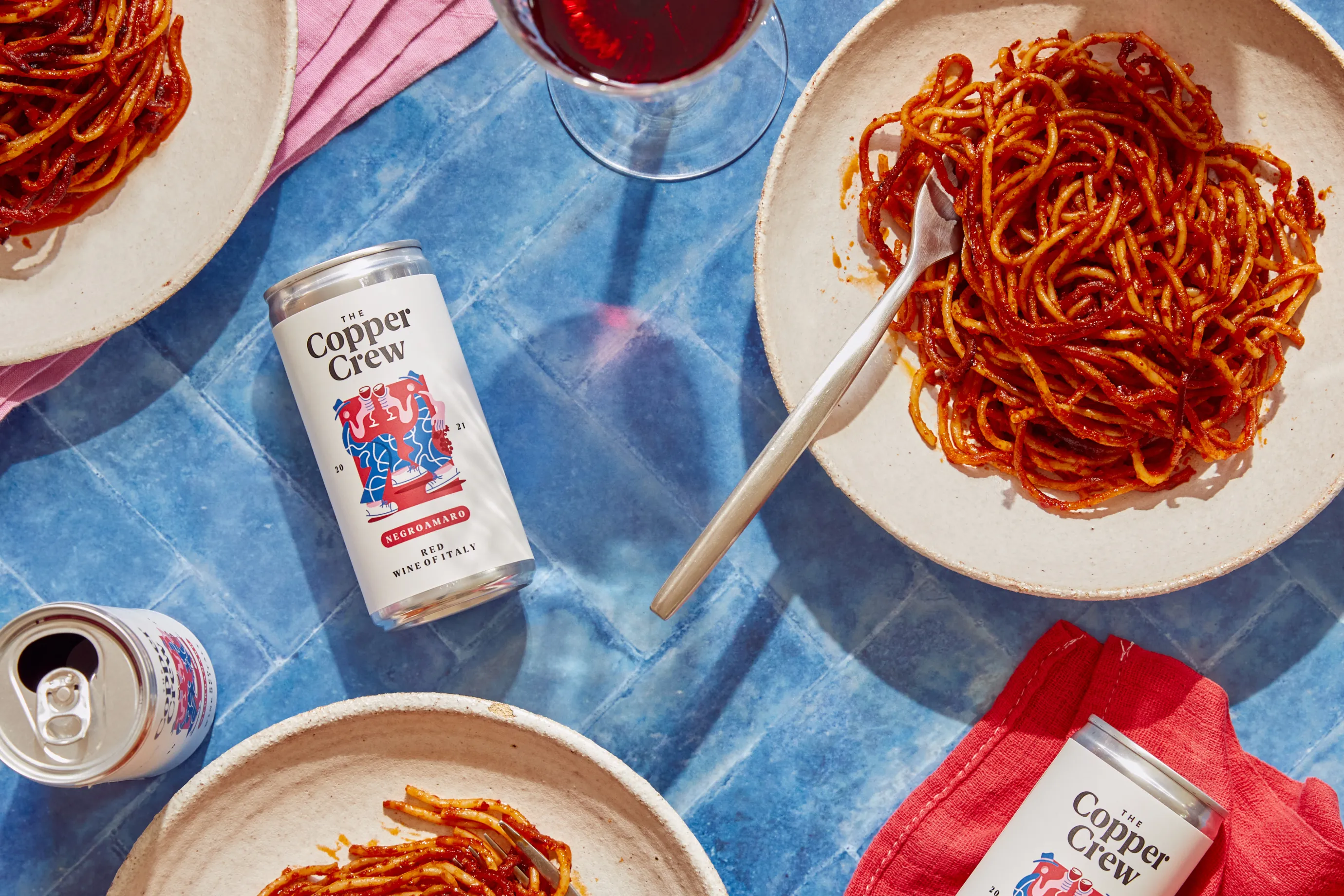
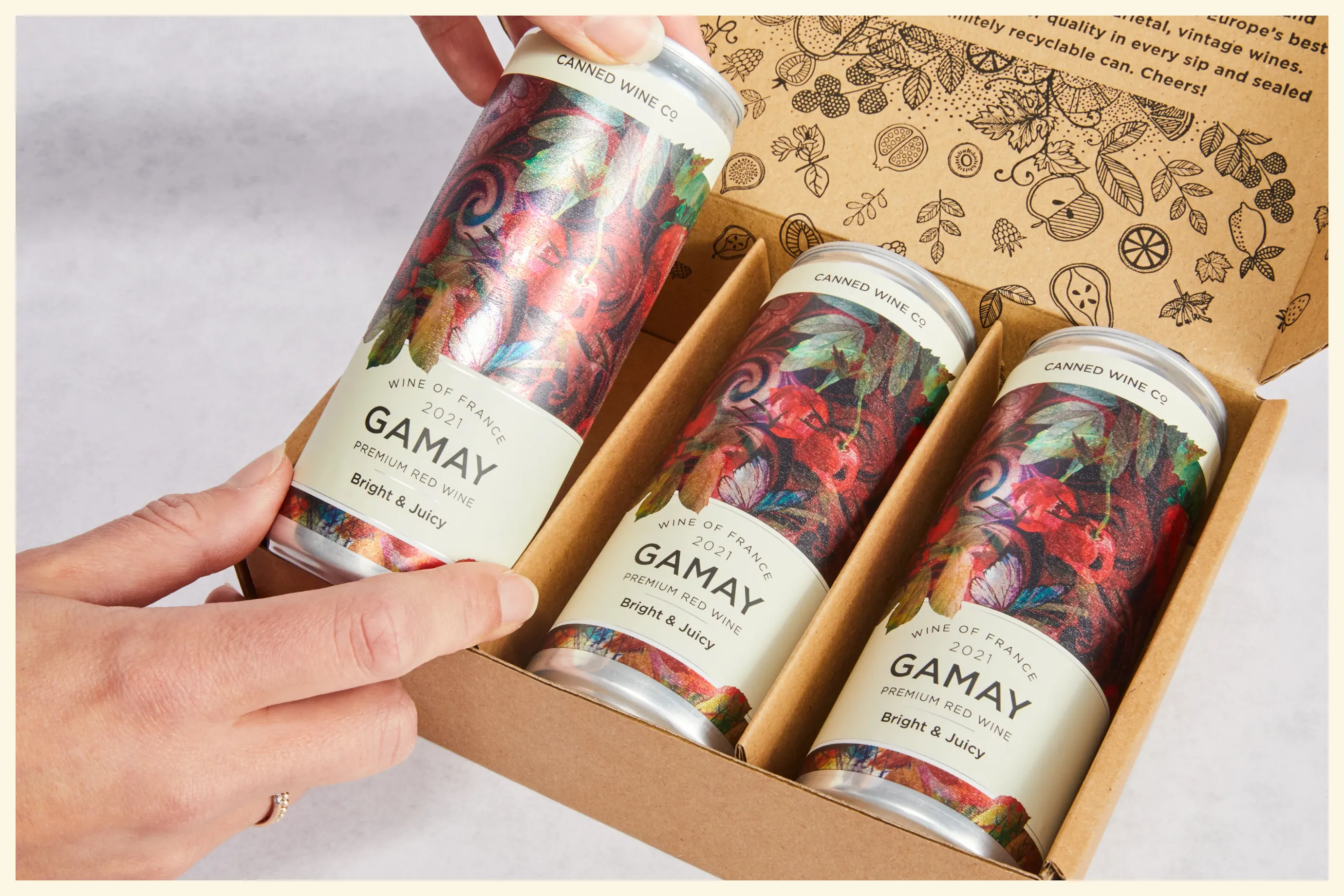
Canned Wine aimed to create a cohesive online presence that showcased their two distinct brands: Canned Wine Co. and The Copper Crew.
To achieve this, we amplified their vibrant colour palette, adding depth to reflect the spirit of their wines. We developed comprehensive style guides to ensure consistency and accessibility.
By balancing the unique characteristics of each brand, we elevated the overall aesthetic and user experience, effectively communicating the distinct offerings of each collection and attracting a wider audience.

The Build
Perfect pairings.
We accelerated the design and development process for both platforms by creating a design system that included a number of reusable components and style guidelines. This ensured we maintained brand consistency and created a seamless user experience.
Canned Wine now has a place to showcase their unique collection of wines and sustainable ethos for both their business and consumer markets. The trade website for businesses is our latest build using WordPress’ Gutenberg editor. And for the first time, we have customised a Shopify theme to bring the Canned Wine brand across to their consumer facing eCommerce website.
Partnering with Canned Wine and being able dive in and understand their world was a great experience for us here at Storm. It was exciting to bring their two vibrant brands to life in both WordPress and Shopify. The unique challenges of this project pushed us to think big in order to deliver success, no matter the platform.
— Storm Project Team


