Recently, we’ve made the decision to move over to Figma, making it the core design tool here at Storm. In this series we’ll be explaining what inspired the big switch, how we think it’s going to help reshape our design process and improve our whole workflow, benefitting both our team, and our clients!
Let me start by stating the obvious…I’m late to the party. 7 years late? Who could say. After all, rumours are dangerous things.
For those of you who are not familiar with the mystiques of the various creative softwares that techy teams such as Storm use, here is a quick sales pitch. Figma (and co) are the pieces of software that not only kick start a project into action but are where the agency and client relationship deepens and mere colleagues become teammates. They are shared, collaborative spaces where plans are made and ideas are born and nurtured. Hopefully that raised an eyebrow of intrigue?
So, a bit of a history lesson
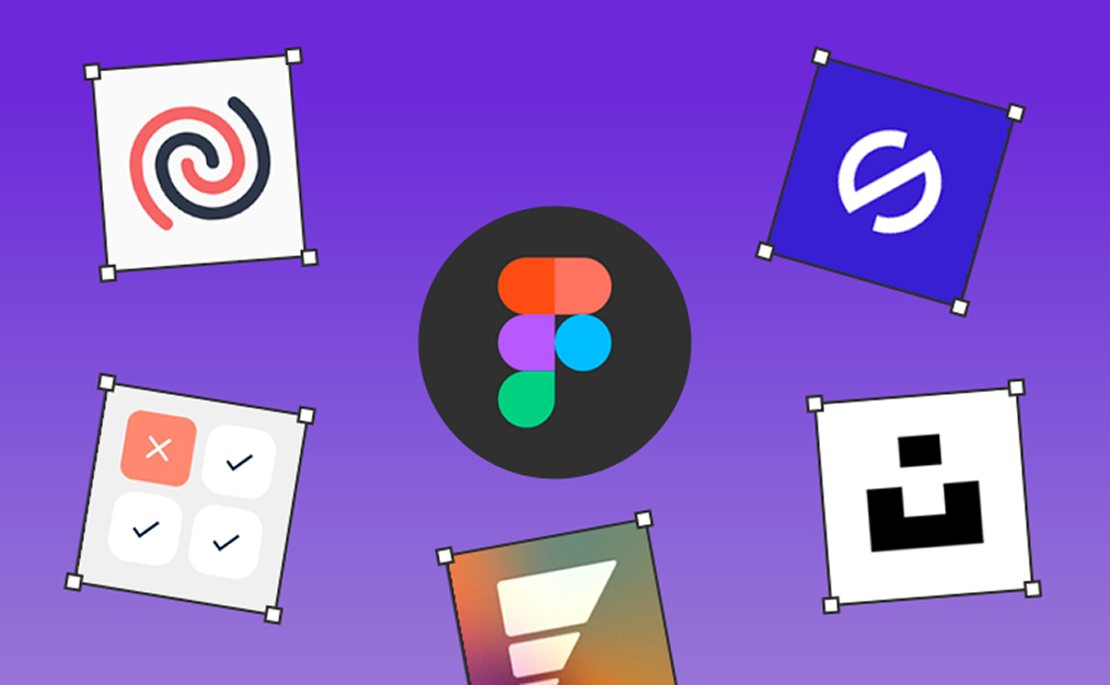
When joining Storm, I was given the freedom to take whichever technical creative direction I wished, meaning I could liberate myself from the well trodden path that was anything Adobe. At the time, there were two main players, and I was faced with a software fork in the road, Figma or Sketch?
After some time experimenting, both seemed like viable options that could serve us well and had more in common with each other than not. Figma’s interface opted for mystery over mastery leaving a lot to be desired (they’ve even mentioned this recently themselves), Sketch on the other hand felt familiar and intuitive, enabling me to concentrate on the job at hand – bringing compelling and impactful designs to our clients
So, that settled it, Sketch it was, and now 7 years have passed and a lot of work has been done with around 50 projects completed and nearly 20 awards following close behind them.
So, what happened, why the switch?
Though comfortable and clearly in our stride, cracks in our processes were starting to show. While working in Sketch, designing became clunky and inarticulate, and accurate execution became grunt work. Developer handovers also became lost in translation and our clients seemed detached from their own products due to no real external collaboration features. As a Creative Director with a guilty conscience, these were red flags that couldn’t be glossed over. Maybe it was time to revisit my fork in the road?
As my frustrations with Sketch continued, I decided to find out what other successful designers, agencies, speakers and collaboration advocates had to say. Spoiler alert – they were all singing the praises of Figma! So, it was time to find out for myself if Figma had improved since our first date 7 years ago.
Our second date
I decided to spend some time giving myself a crash course in the new ways of Figma. This quickly resembled a quick-fire movie montage of amazement, glee, jealousy and excitement.
Figma has had a new lease of life and to my surprise, mastery had replaced the mystery! It’s quick, slick, works with me, not against me, and much like Sketch 7 years ago, allows me to concentrate on my most important task – designing. I had just been introduced to a whole new way of life.
Not only that, but collaboration tools such as FigJam for us to use alongside our clients, new design tools such as Auto Layout, Component Properties, plus Dev Mode which Hannah will talk about later in the series, meant my second date with Figma was a success. We’ve already started rolling it out for both client and internal projects, so let’s see where this relationship takes us!
Next time, I’ll delve deeper into my favourite new design tools, and how they have improved my workflow in the next part of this series.
To be continued…